Categories


“Finding patterns is the essence of wisdom.” – Dennis Prager
We stumble upon numerous patterns every day. Be it the pavement blocks on the sidewalks of roads that you have been away from for quite some time since Covid said hi, or be it the majestic art you subconsciously make when left with a pen and paper while you’re on a call.
There are patterns that we have explanations for and patterns for which we haven’t found explanations, yet. There are patterns that re-appear at places that we expect them to reappear at, like the normal distribution curve that made its way to most of your college assignments :P.
Then there are patterns that appear at places that don’t really make the most sense at first. Today we dive into one such journey, from one place to another seemingly different place, where we find the same pattern.
The hashtag #NoHumanIsLimited came around the buzz in October 2019 when renowned athlete Eliud Kipchoge showcased to the world something considered beyond human limits until then. He clocked a flabbergasting time for a full 42km long marathon distance at 1:59:40. Apart from the astonishing fact that this is the only time someone has completed a marathon at a sub 2hour mark, what makes it so amazing can be seen from the following chart.
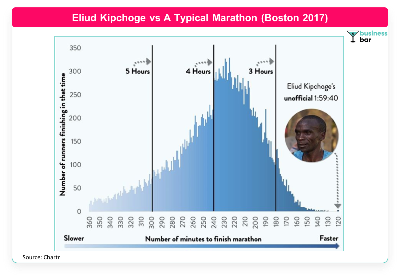
Amazing data visualizers at UK based Chartr plotted the number of athletes finishing the Boston Marathon 2017 against the time taken by them. The narrow right tail of the bell-like curve tells us how Eliud Kipchoge’s record has put him in a league by himself. The kind of outlier he appears on that chart shows why it is something that represents #NoHumanIsLimited.
But there’s one more peculiarity in the chart that catches attention. Do you see the sharp dip just after the 4hour mark? There’s a huge difference in the number of runners finishing the daunting task just before and just after 4hours of time. Is it just a coincidence!? It could be one, but a dip of around 30-35%, makes it highly unlikely to be a mere coincidence.
Boston Marathon is one of the toughest events of its kind and usually features trained athletes who go through a screening process (usually by submitting their previous best official times) before they are allowed to participate. Hence it is important to understand that the sample set of the population that this chart shows is not completely random but consists of people who seriously train for the event. Serious players only.
Coming back to the sudden dip, a plausible explanation for the dip is that a relatively high number of runners set the psychological target of completing the daunting task under four hours and do training with the same goal in mind, and many are successful in just hitting the target too, and hence the dip.
After all, the apparent difference between 3:59:59 and 4:00:01 is more than that between 3:59:59 and 3:59:57! Or if it floats the boat for you, how about the seeming difference between 91% and 89% or that between 89% and 87%. While the differences, in theory, are equal, to the human mind they’re not exactly.
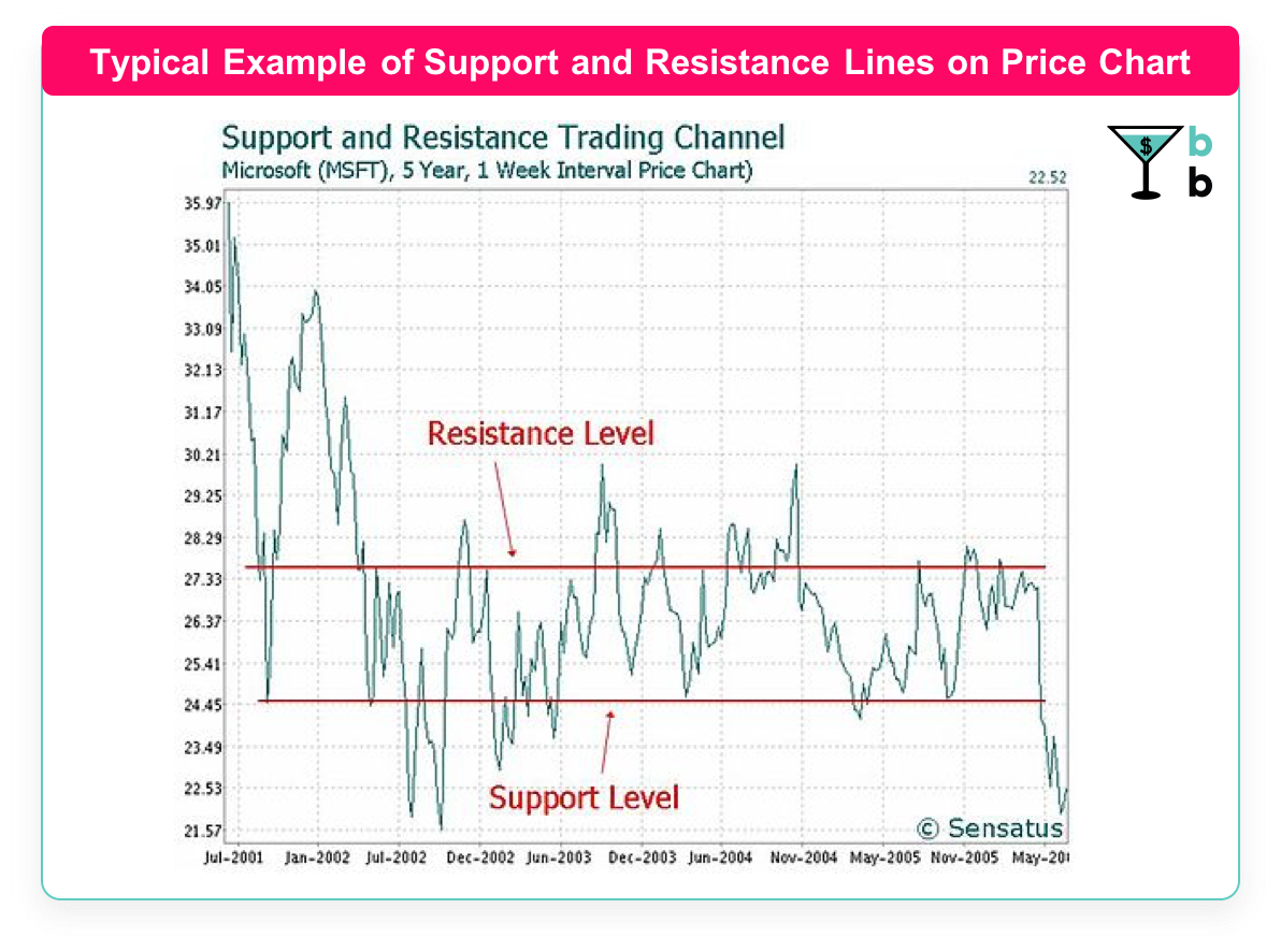
The same influence that these round numbers have on how people behave can also be seen in the financial markets too. Anyone a little familiar with the markets can easily tell you how prices equaling round whole numbers such as 100, 20, or say 500, act as either supports or resistances.
As the name suggests, support means that it is hard for the price to go below that point. Resistance, on the other hand, is the price level that acts more like a ceiling, crossing that price is perceived harder.
Most of the retail individual investors and for that matter, even the institutional ones place target prices or stop orders at round number levels. Investopedia tries to deconstruct this phenomenon in quite a simpler manner which we would like to present here verbatim: ‘If all the clients of an investment bank put in sell orders at a suggested target of, for example, $55, it would take an extreme number of purchases to absorb these sales and, therefore, a level of resistance would be created.’
Well, for those who are the disciples of value investing, these things might not make much sense, but for those engaged in technical analysis, these are the basics to build on. Which is better? It is a debate far from settled. Let’s leave it that way.
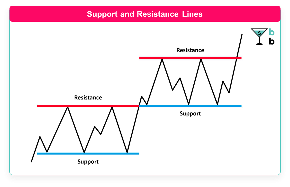
Another interesting aspect of supports and resistance is their tendency to change polarity. That is, if the price of a stock (or any financial instrument for that matter) goes above a resistance, the same resistance price level becomes a new support, or if a support is broken, meaning the price tumbles below it, the same level becomes a new resistance. The same can be seen in the infographic below.
For instance, once a stock crosses $100 as market price, the value of 100 becomes a strong support. But once it goes south you might very well get to hear, “Dude, it’s down to double digits there’s gotta be something wrong”, and the value 100 now acts as a resistance. That being said, it is noteworthy to understand that supports and resistances are not exclusively seen at round numbers, there can be other reasons too for some price level being a support or resistance. For example, the all-time high price of a stock is often considered a strong resistance.
Coming back to the Marathon times, you might wonder why only at the 4-hour mark do we see the dip, why not other round numbers say the 3-hour mark? Well, yes you will find the dip at 3 and 5-hour marks too, in fact, if one looks closely, there are dips at half-hour intervals too. Only the effects are more or less profound to observe depending on where you see.
All in all, isn’t it wonderful how our choice of the number system we adopted shapes our behavior in all the varied kinds of interactions that happen around the world. From running on the street, to trading on the wall street.
1 comment